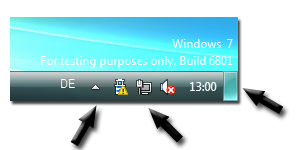
I noticed some interesting stuff on some “leaked” screenshots from Windows 7 (M3) – there are some changes going on in the lower right corner.

I can see a couple of changes that draws my attention.
“Hidden icons” icon
The icon you can click on to show the hidden icons in the notification area has changed. Is it more than this? By the looks of the icon my guess is that it is more than just showing the hidden ones.
The spacing to the right
The thing that looks most interesting is the space to the right of the Notification Area, to the right of the clock. What is this? Anybody? Does it belong to the Notification Area or is it something new to the Taskbar in general?
New icons
New icons for battery, network and audio. Nothing new about this. The graphic elements always changes…
Icon spacing!
What really looks annoying is the spacing between the icons! Already today I think there is a waste of space down there between the system icons and the application icons. Now it seems like there will be even more spacing between all of the icons. Hey Windows 7 team, pull your strings together and tighten the icons a bit or at least make it customizable.
The Engineering Windows 7 blog recently posted an article about the user interface and Taskbar in particular. Not much is said about the Notification Area except that they are trying to make it “less noisy and something more controllable by the end-user”.
PDC 08 is only a few weeks away and I think I will get my answers then. See ya’ll in Los Angeles.
