I have now done some initial testing and evaluation of the 6801 build of Windows 7, which we got at PDC 2008. First of all I was a bit disappointed that we did not get the updated UI that were shown during the keynote, instead we got a previous build that does not have that much changes in the UI.
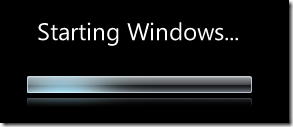
It boots pretty quick on my Virtual PC, yes I run it there – a little to early to switch out my main OS, and it has a nicer loading screen than Vista.

 First you notice that the notification area has got some changes; by default only the volume, network and Solution Center icons are present, you can configure it to show all icons by default if you want to. When you hover them you get a smaller and less graphical tooltip than on Vista and a small highlight of the icon. The area to the right of the clock shows the desktop if you click it, on later builds it will show your desktop with the current windows transparent (shown at the keynote).
The Sidebar is now changed so it is not a side bar anymore, you can place your Gadgets all over the screen. Funny, they even took this one out of the Vista beta for a while…
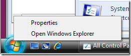
The Start Button
The Start Button glows a little more in this build than in Vista when hovered, but the version we saw at the PDC keynote looked a little bit more different. But, the interesting stuff is what happens when you right-click it! Now think how you normally starts Windows Explorer with the mouse – I bet that you do not go into the Start menu and select the Explorer program but instead you right click the Start button and selects Explore or Explore All Users and then you find yourself in Explorer and navigates back to the drive root from the Start Menu folder. No more in Windows 7! When you right click you just select Open Windows Explorer and voila – just as hitting Win-E! Nice!

The Windows 7 Control Panel
The Control Panel has changed a lot, it looks like they have worked most of the items over all in some nice and smooth transitional effects.
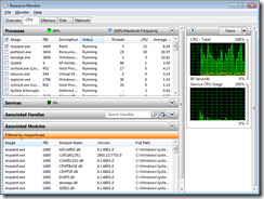
 The Resource Monitor have been updated heavily and are now a really interesting tool for monitoring your PC. You can easily select which processes or services to monitor. When checking out the processes you can filter out which to watch and inspect which modules and handles they have. Same filtering works for network and disc – you can see how much network or disc a specific process uses. When monitoring the network you can even see which ports and protocols a certain process uses and if the firewall blocks it or not. Good job, this will be useful!
Some new control panel stuff:
- Clear Type Tuner is there by default
- Biometric devices
- Default location and Location and other sensors – used for location awareness
- Pen and Touch instead of Pen and Input Devices
- Credential Manager – Manage your Windows and certificate based credentials
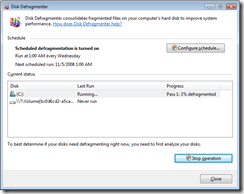
 The Windows 7 Disk Defragmenter
The Disk Defragmenter now includes an Analyze function so you can analyze your discs, and you can more easily see when you last defragmented your disks. And you can even see how your defragmentation is doing – couldn’t I do that in Windows XP? The scheduling also includes which disks to defragment during a scheduled defragmentation.
There are of course more cool stuff, such as the usage of the Ribbon controls in Paint and Wordpad and the new calculator etc…
Technorati tags: Windows 7
