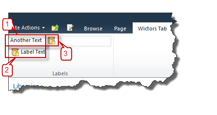
The first control in the SharePoint 2010 Ribbon Controls series (full series index available here) will be about the Label control.
What is the Label control?
The Label control is a simple control that allows you to add a Label to any of your Ribbon groups. Labels are most often used in combination with other controls such as text boxes and drop downs. You can using a label target another control so that if you click on the label then the other control gets focus. A Label can be a text, an icon or both.

As the image above shows Labels can have three forms:
- Just a text label
- A text label with an icon
- Just an icon
Sample Label control
This is how a Label control could be defined:
Label
  Id="Wictor.RibbonControls.Tab.Label"
  LabelText="Label Text"
  Image16by16="/_layouts/Images/Wictor.RibbonControls/Wictor.RibbonControls.png"
  Image16by16Left="0"
  Image16by16Top="-32"
  Image16by16Class="LabelClass"
  TemplateAlias="section2"
  ForId="Wictor.RibbonControls.Tab.TextBox"
  Command="Wictor.RibbonControls.LabelComand"
  QueryCommand="Wictor.RibbonControls.LabelQueryCommand"
  Sequence="10"/>
Label control properties
The Label control have a few properties worth noticing, except the common ones.
Property: LabelText
The LabelText property is the text that is displayed in the label.
Property: Image16by16, Image16by16Top, Image16by16Left, Image16by16Class
A Label can have one16x16 pixel sized icon and/or CSS class.
Property: TemplateAlias
The TemplateAlias (one of the common properties) must be configured so that is connected to a section in the Group Template that has the DisplayMode of either Medium or Small. Any other Display Modes will cause your Ribbon customization to fail. The LabelText, TemplateAlias and icon determines the layout of the Label:
- A Small DisplayMode must have an icon and will only show the icon (only text on a small Label will cause an error). Label #3 in the image above
- A Medium sized icon must have a LabelText and optionally an icon. Label #1 and #2 in the image above.
Property: ForId
The ForId property is the Id of another Ribbon control. When the Label is selected the control specified by the ForId will get focus.
Property: Command
The Command property is never used by the Label control.
Property: QueryCommand
The QueryCommand property invokes the command when the Tab containing the control receives focus. This can be used to dynamically update the value of the LabelText. In a JavaScript Page Component you update the LabelText as follows, if the QueryCommand has the value of ‘Wictor.RibbonControls.LabelQueryCommand’:
handleCommand: function (commandId, properties, sequence) {
    switch (commandId) {
        case 'Wictor.RibbonControls.LabelQueryCommand':
            properties['Value'] = 'Label changed';
            return;
    }
}
When the Tab receives focus the Label will change its LabelText to the value specified in the JavaScript.
Summary
That was the first one - the Label control. Next time we’ll add a TextBox which will be connected to the Label using the ForId property.
