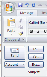
 I have been running Microsoft Outlook 2007 Beta 2 Technical Refresh now for a while and it’s a great improvement to the Beta 2 but. There have been a lot of changes to the user interface in this release.
One thing that annoys me is the location of the Send button in a mail that you are composing. The most natural place should be where the Paste button is placed today.
My suggestion is to insert a slot for the Send button to the left of the Clipboard in the Ribbon bar.
What do you think?
